For more detail about possible style overrides, see the Reference page.
Basic Example
In this example, we change the text color to dark gray, the primary button to blue, and the secondary button to red. This demonstrates the fundamental approach to customizing Dromo’s appearance.Global Styling
Theglobal section controls application-wide styles that affect multiple components throughout the uploader. These settings provide a foundation for your design system and ensure visual consistency across all screens.
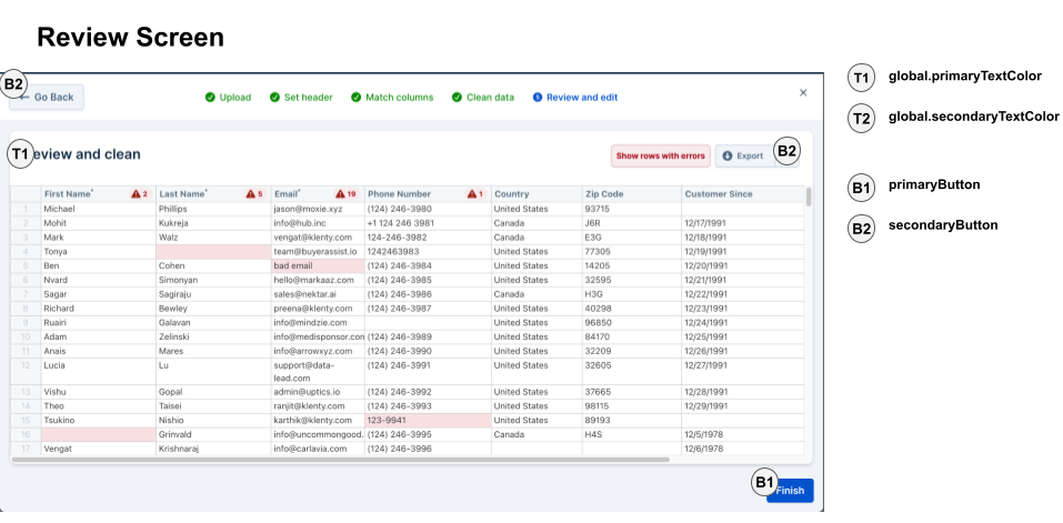
Text Colors
Control the color hierarchy for text throughout the application:textColor- Default text color for body text and general contentprimaryTextColor- Emphasized text such as headings, labels, and important informationsecondaryTextColor- De-emphasized text like descriptions, hints, and supplementary information
Status Colors
Define colors for conveying state and feedback to users:successColor- Indicates successful operations, valid data, and positive stateswarningColor- Highlights warnings, potential issues, and cautionary information
Typography
Integrate your brand’s typography:customFontURL- URL to load custom fonts (e.g., Google Fonts, Adobe Fonts, or self-hosted fonts)customFontFamily- CSS font-family declaration to apply the custom font
When using custom fonts, ensure the font URL is accessible and supports CORS. The font will be loaded asynchronously to avoid blocking the uploader initialization.
Container Styling
Control the appearance of modal containers and panels:backgroundColor- Background color for the main uploader containerborderRadius- Corner radius for rounded elements (e.g., “8px”, “0.5rem”)borderWidth- Thickness of borders throughout the applicationborderColor- Default border color for dividers and containersborderStyle- Border style (e.g., “solid”, “dashed”, “dotted”)
Visual Effects
backdropBlur- Boolean to enable/disable the blur effect on the modal backdrop. When enabled, the background behind the modal will have a frosted glass effect.
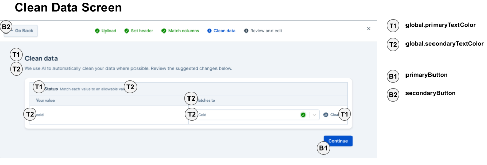
Button Styling
Dromo uses three button types throughout the interface: primary (main actions), secondary (alternative actions), and tertiary (subtle actions). Each button type can be fully customized with normal and hover states.Primary Buttons
Primary buttons are used for the main call-to-action on each screen (e.g., “Continue”, “Submit”, “Finish”). These should be the most visually prominent buttons. Use cases:- Advancing to the next step in the workflow
- Submitting final data
- Confirming important actions
Secondary Buttons
Secondary buttons provide alternative or less critical actions (e.g., “Back”, “Skip”, “Cancel”). Use cases:- Navigating back to previous steps
- Canceling or closing modals
- Secondary actions that complement the primary action
Tertiary Buttons
Tertiary buttons are the most subtle option, typically used for optional actions or inline controls. Use cases:- “View details” or “Show more” links
- Inline editing actions
- Optional helper actions
Button Properties
Each button type supports the following properties:borderRadius- Corner radius (e.g., “0.375rem”, “4px”)backgroundColor- Fill colortextColor- Text/label colorborder- Border style (e.g., “1px solid #3b82f6”)hoverBackgroundColor- Fill color on mouse hoverhoverTextColor- Text color on mouse hoverhoverBorder- Border style on mouse hoverdisabledBackgroundColor- Fill color when the button is disabled (default:#e5e7eb)disabledTextColor- Text color when the button is disabled (default:#6b7280)padding- Button padding (default:8px 12px)
Table Styling
The data table (powered by Handsontable) is the core interface where users view, edit, and validate their data. Extensive styling options allow you to match your application’s design while maintaining usability.Column Headers
Headers identify each column and show field names from your schema.headerBackgroundColor- Background color for column headersheaderTextColor- Text color for column headersheaderFontWeight- Font weight (e.g., “400”, “500”, “600”, “700”, “bold”)
Active & Highlighted Headers
When users interact with columns (selecting, mapping, or hovering), headers can change appearance to provide visual feedback.headerActiveBackgroundColor- Background when the column is currently active/selectedheaderActiveTextColor- Text color when activeheaderHighlightedBackgroundColor- Background when the column is highlighted (e.g., during drag operations)headerHighlightedTextColor- Text color when highlighted
Row Headers
The leftmost column displays row numbers to help users reference specific data rows.rowHeaderBackgroundColor- Background color for the row number columnrowHeaderTextColor- Text color for row numbers
Corner Header
The top-left cell where the row header and column header intersect.cornerHeaderBackgroundColor- Background color for the corner cell
Cell Styling
Basic styling for data cells in the table.cellBackgroundColor- Default background for all cellscellTextColor- Default text color for cell contentcellHoverBackgroundColor- Background when hovering over a cellcellHoverTextColor- Text color when hovering
Alternating Rows
Improve readability with zebra-striping (alternating row colors).oddRowBackgroundColor- Background color for odd-numbered rows
Selection Styling
Visual feedback when users select cells or rows.cellSelectionBorderColor- Border color around selected cellscellSelectionBackgroundColor- Background color for selected cells (use semi-transparent colors like “rgba(59, 130, 246, 0.1)”)rowSelectedBackgroundColor- Background color for entire selected rowsrowSelectedBorderColor- Border color for selected rows
Borders & Dividers
Control the table’s grid lines and borders.borderColor- Main border color for the table’s outer edgesdividerColor- Color for grid lines between rows and columns
Cell States
Cells can display validation states using different colors to communicate errors, warnings, or informational messages. Error States (validation failures, required fields missing):errorCellBackgroundColor- Background for cells with errorserrorCellHoverBackgroundColor- Background when hovering over error cells
warningCellBackgroundColor- Background for cells with warningswarningCellHoverBackgroundColor- Background when hovering over warning cells
infoCellBackgroundColor- Background for cells with informational messagesinfoCellHoverBackgroundColor- Background when hovering over info cells
Use distinct but harmonious colors for different states. For example, light red for errors, light yellow for warnings, and light blue for info. Ensure sufficient contrast for accessibility.
Read-Only Cells
Some cells may be locked from editing based on your field configuration.readOnlyCellBackgroundColor- Background for non-editable cellsreadOnlyCellTextColor- Text color for read-only content
Accent Color
A general-purpose accent color used for various interactive elements in the table.accentColor- Primary accent color for controls, highlights, and interactive elements
Card Styling
Cards are used throughout Dromo for displaying field mappings, data enhancement options, and review summaries. Card styling helps organize information into digestible sections.Card Properties
backgroundColor- Background color for individual cardscontainerBackgroundColor- Background color for the area containing multiple cardsborderColor- Border color around cardsborderWidth- Thickness of card bordersborderRadius- Corner radius for rounded cardstextColor- Default text color within cardsexpandedBackgroundColor- Background color when a card is expanded (for cards with collapsible content)iconColor- Color for icons displayed within cards
- Column matching screen: Each field in your schema is displayed as a card
- Data enhancement screen: Suggested fixes and transformations appear in cards
- Review screen: Summary information is organized in cards
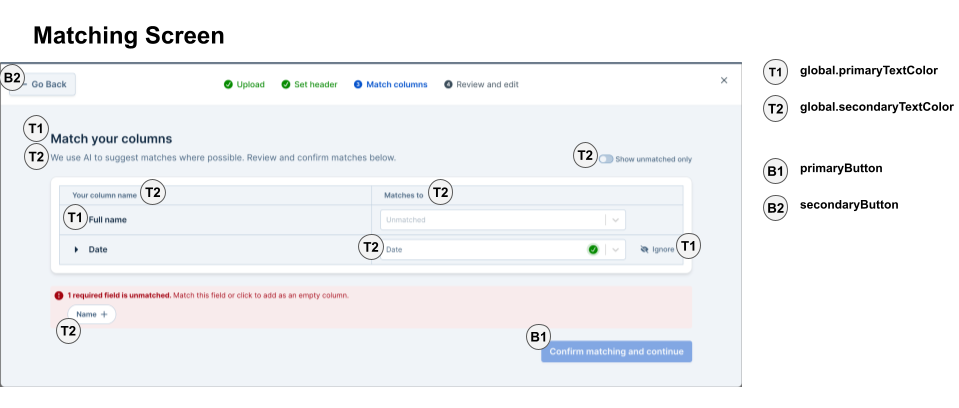
Dropdown Styling
Dropdown menus (select components) are used for field mapping, choosing data types, and selecting transformation options.Dropdown Properties
backgroundColor- Background color of the closed dropdownborderColor- Border color around the dropdowntextColor- Text color for the selected valuemenuBackgroundColor- Background color of the opened dropdown menuoptionHoverBackgroundColor- Background color when hovering over an optionoptionSelectedBackgroundColor- Background color for the currently selected option
- Selecting which schema field a column maps to
- Choosing date formats during data transformation
- Selecting validation rules
Additional UI Elements
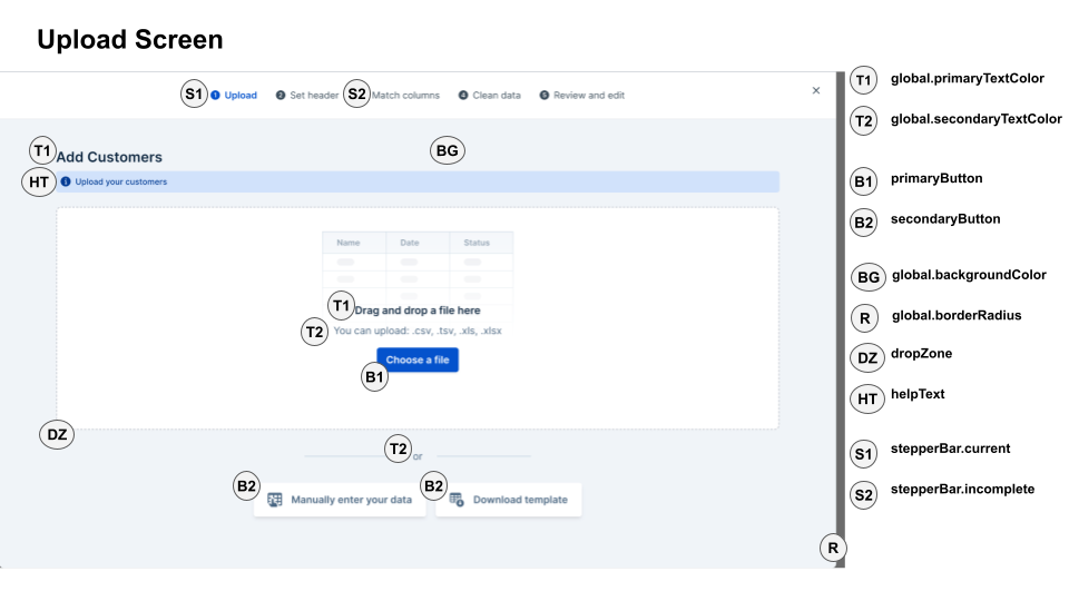
Dropzone (File Upload Area)
The dropzone is the drag-and-drop area on the upload screen where users can drop files or click to browse.Properties
borderWidth- Thickness of the dropzone border (number, e.g., 2)borderRadius- Corner radius (number, e.g., 8)borderColor- Border colorborderStyle- Border style (e.g., “dashed”, “solid”, “dotted”)backgroundColor- Background colorcolor- Text color for the dropzone messageoutline- CSS outline property (e.g., “none”, “2px solid blue”)
Help Text
Help text appears throughout the interface to provide guidance, tips, and contextual information to users.Properties
textColor- Color of help textbackgroundColor- Background color for help text sections (if applicable)
- Instructions on the upload screen
- Field descriptions during column matching
- Tips for fixing data errors
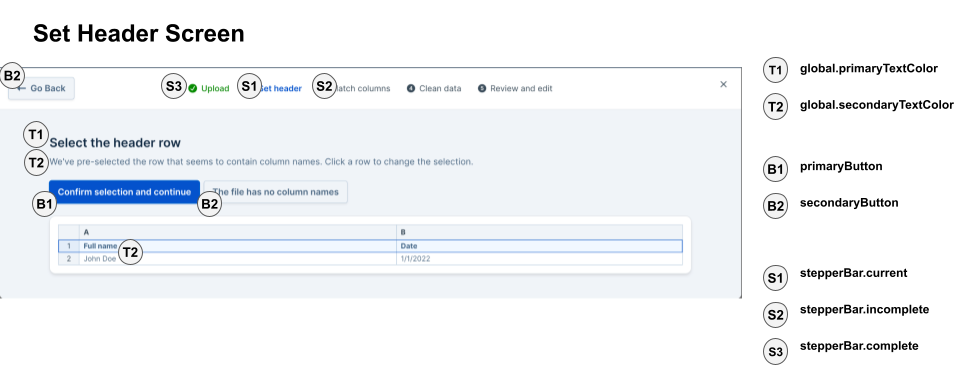
Stepper Bar (Progress Indicator)
The stepper bar displays the user’s progress through the multi-step upload workflow (Upload → Set Headers → Match Columns → Clean Data → Review).Properties
completeColor- Color for completed stepsincompleteColor- Color for steps not yet reachedcurrentColor- Color for the current stepfontSize- Font size for step labelscompleteFontWeight- Font weight for completed step labelsincompleteFontWeight- Font weight for incomplete step labelscurrentFontWeight- Font weight for the current step labelbackgroundColor- Background color of the stepper barborderBottom- Border at the bottom of the stepper bar
Use distinct colors that clearly communicate progress. A common pattern is green for completed, gray for incomplete, and blue for the current step.
Modal Overlay
The semi-transparent overlay that appears behind the uploader modal, covering the parent application.Properties
backgroundColor- Color of the overlay (typically black or dark gray)opacity- Opacity value from “0” to “100” (string)