> ## Documentation Index
> Fetch the complete documentation index at: https://developer.dromo.io/llms.txt
> Use this file to discover all available pages before exploring further.
# Field Types
> Dromo supports a variety of field types, each with their own unique properties and behaviors. This section describes the different types of fields available and their usage.
## Usage
The field type is set by passing a `type` parameter in the field object. This can be a string referring to one of the field types, explained below. Alternatively, some field types can take additional options controlling their behavior and format. In this case, you can provide the `type` parameter with a 2-element array, where the first element is the type name and the second element is any options that field type takes.
Here is an example of a few different valid field type configurations:
```json theme={null}
{
"fields": [
{
"label": "Email address",
"key": "email",
"type": "email"
},
{
"label": "Subscription fee",
"key": "subscriptionFee",
"type": ["number", "eur"]
},
{
"label": "Subscribed since",
"key": "subscriptionStart",
"type": ["date", { "locale": "de-DE" }]
}
]
}
```
## Types
### String[](#string "Direct link to String")
> `type: "string"`
By default (if no field type is specified), all fields in Dromo have the `string` type. This is the simplest field type, and does not do any validation or transformation of the data – the data is output as a string exactly as it was entered.
The string type does not take any options.
### Number[](#number "Direct link to Number")
> `type: "number"`
> `type: ["number",
]`
```json theme={null}
{
"type": ["number", {
"preset": "",
"round": "",
"displayFormat": "",
"outputFormat": "",
"min": "",
"max": ""
}]
}
```
#### For all kinds of numeric values[](#for-all-kinds-of-numeric-values "Direct link to For all kinds of numeric values")
The field type parses many common number formats and displays the number in a user-friendly format.
If the input data is unable to be parsed as a number, a validation error is added to the cell.
Unless an output format is specified, the number is output to the result JSON as a number.
#### Presets[](#presets "Direct link to Presets")
The number type has several presets available to handle the most common number formats. You can use a preset by passing the name of the preset with the field type, such as `type: ["number", "usd"]`.
Here are all of the presets that Dromo provides:
| Preset Name | Source value | Display value |
| ------------------------------------------------ | ---------------- | ---------------------- |
| `default`(used if no display settings are given) | 1234567.1234567 | 1,234,567.1234567 |
| `percent` | 0.12340.56 | 12.34%56% |
| `plain` | 1234567.123 | 1234567.123 |
| `usd` | 1234.567-3456.78 | $1,234.57-$3,456.78 |
| `usd_accounting` | 1234.567-3456.78 | $ 1,234.57$ (3,456.78) |
| `eur` | 1234.567-3456.78 | 1,234.57 €-3,456.78 € |
| `gbp` | 1234.567-3456.78 | £ 1,234.57- £3,456.78 |
| `decimal_0` *or*`integer` | 234.567 | 235 |
| `decimal_1` | 234.567123 | 234.6123.0 |
| `decimal_2` | 234.567123 | 234.57123.00 |
| `decimal_3` | 234.5678123 | 234.568123.000 |
| `decimal_4` | 234.56789123 | 234.5679123.0000 |
| `percent_0` | 0.1256 | 13% |
| `percent_1` | 0.12560.34 | 12.6%34.0% |
| `percent_2` | 0.125670.34 | 12.57%34.00% |
| `percent_3` | 0.1234560.34 | 12.346%34.000% |
| `percent_4` | 0.123456780.34 | 12.3457%34.0000% |
#### Custom configuration[](#custom-configuration "Direct link to Custom configuration")
If none of the presets meet your needs, you can define your own rounding, display format and output format behavior.
The `round` setting takes an integer which defines how many digits after the decimal point the value will be rounded to. Negative values will round to digits before the decimal.
The `displayFormat` and `outputFormat` settings can be used for creating your own custom formats. The `displayFormat` is used for displaying the number to the user on the review screen. The `outputFormat`, if set, will determine how the number is output in the result JSON, as a string.
For more information on using `displayFormat` and `outputFormat`, see the [number formatting section](/reference/fields/field-types#number%E2%80%8B).
#### Validating minimum and maximum[](#validating-minimum-and-maximum "Direct link to Validating minimum and maximum")
You can validate that the number falls within a given range using the `min` and `max` settings.
The `min` and `max` settings are optional and you can specify none, one or both. If a given number falls below the `min` or above the `max`, a validation error will be added to the field.
> `type: "date"`
```json theme={null}
{
"type": ["date", {
"locale": "
",
"displayFormat": "",
"outputFormat": "",
"autofix": ""
}]
}
```
#### For handling date values (with no time)[](#for-handling-date-values-with-no-time "Direct link to For handling date values (with no time)")
The date type parses dates in several formats including:
* **ISO-8601** (e.g., `2024-03-27`, `2024-03-27T10:30`)
* **RFC-2822** (e.g., `27 Mar 2024`)
* **Common date formats** (e.g., `03/27/2024`, `27/03/2024`, `27.03.2024`)
* **Two-digit years** (e.g., `03/27/24` → `2024-03-27`)
* **Unpadded dates** (e.g., `3/7/2024` → `2024-03-07`)
* **Various separator styles** (dots, slashes, dashes)
If a time is also given, it is allowed but ignored. If an input date cannot be parsed, a validation error will be added to the cell.
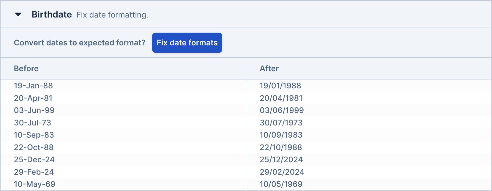
When using a date field, Dromo's enhanced date detection will analyze the imported data and suggest appropriate formatting fixes during the Bulk Fix step. The system uses heuristic-based detection to identify various date patterns and recommend the most likely correct interpretation.
 #### Automatic Date Fixing[](#automatic-date-fixing "Direct link to Automatic Date Fixing")
You can control whether date format fixes are applied automatically or require user approval using the `autofix` parameter:
* **`autofix: true`** (default): Date format fixes are applied automatically without requiring user interaction. If all date fields in your schema have autofix enabled, the Bulk Fix step will be skipped entirely.
* **`autofix: false`**: Date format fixes are suggested to the user during the Bulk Fix step, requiring manual approval before being applied.
The enhanced date detection system can automatically handle:
* **Ambiguous date formats** (e.g., distinguishing between MM/DD/YYYY and DD/MM/YYYY based on data patterns)
* **Mixed formats within the same column** (e.g., some rows using `03/27/2024` and others using `27-Mar-2024`)
* **Two-digit year conversion** with intelligent century detection
* **Locale-aware parsing** that respects the field's configured locale for format interpretation
This is particularly useful when you want to ensure users review date formatting changes, or when you want to streamline the import process for trusted data sources.
The `autofix` parameter is currently only available for date fields. Datetime and time fields do not support this feature.
By default, dates are output to the results in ISO-8601 format (e.g. `"2022-03-27"`).
You can specify a locale for the date field, which must be a valid [BCP 47 locale string](https://developer.mozilla.org/en-US/docs/Web/JavaScript/Reference/Global_Objects/Intl#locale_identification_and_negotiation). If not provided, the locale defaults to `"en-US"`.
The locale will change how the date is displayed to the user with the display format. The locale will also affect the output format if a custom format is used.
The default display format is the standard short form in the configured locale, for example:
| Locale | Default format example |
| ------ | ---------------------- |
| en-US | 3/27/2022 |
| ar-SY | ٢٧/٣/٢٠٢٢ |
| de-DE | 27.3.2022 |
| pt-BR | 27/03/2022 |
| th-TH | 27/3/2565 |
| zh-CN | 2022/3/27 |
You can define your own display and/or output formats with a format string. For more information, see the [datetime formatting section](/reference/fields/field-types#datetime%E2%80%8B).
#### Automatic Date Fixing[](#automatic-date-fixing "Direct link to Automatic Date Fixing")
You can control whether date format fixes are applied automatically or require user approval using the `autofix` parameter:
* **`autofix: true`** (default): Date format fixes are applied automatically without requiring user interaction. If all date fields in your schema have autofix enabled, the Bulk Fix step will be skipped entirely.
* **`autofix: false`**: Date format fixes are suggested to the user during the Bulk Fix step, requiring manual approval before being applied.
The enhanced date detection system can automatically handle:
* **Ambiguous date formats** (e.g., distinguishing between MM/DD/YYYY and DD/MM/YYYY based on data patterns)
* **Mixed formats within the same column** (e.g., some rows using `03/27/2024` and others using `27-Mar-2024`)
* **Two-digit year conversion** with intelligent century detection
* **Locale-aware parsing** that respects the field's configured locale for format interpretation
This is particularly useful when you want to ensure users review date formatting changes, or when you want to streamline the import process for trusted data sources.
The `autofix` parameter is currently only available for date fields. Datetime and time fields do not support this feature.
By default, dates are output to the results in ISO-8601 format (e.g. `"2022-03-27"`).
You can specify a locale for the date field, which must be a valid [BCP 47 locale string](https://developer.mozilla.org/en-US/docs/Web/JavaScript/Reference/Global_Objects/Intl#locale_identification_and_negotiation). If not provided, the locale defaults to `"en-US"`.
The locale will change how the date is displayed to the user with the display format. The locale will also affect the output format if a custom format is used.
The default display format is the standard short form in the configured locale, for example:
| Locale | Default format example |
| ------ | ---------------------- |
| en-US | 3/27/2022 |
| ar-SY | ٢٧/٣/٢٠٢٢ |
| de-DE | 27.3.2022 |
| pt-BR | 27/03/2022 |
| th-TH | 27/3/2565 |
| zh-CN | 2022/3/27 |
You can define your own display and/or output formats with a format string. For more information, see the [datetime formatting section](/reference/fields/field-types#datetime%E2%80%8B).
> `type: "datetime"`
```json theme={null}
{
"type": ["datetime", {
"locale": "",
"displayFormat": "",
"outputFormat": "",
"withSeconds": ""
}]
}
```
#### For handling a date and time together in one field[](#for-handling-a-date-and-time-together-in-one-field "Direct link to For handling a date and time together in one field")
The datetime type parses datetimes in several formats: ISO-8601, RFC-2822, and the configured display format in the configured locale.
By default, dates are output to the results in ISO-8601 format, with no time zone offset (e.g. `"2022-03-27T15:20"`).
By default, seconds are neither displayed nor output. You can change this by providing `withSeconds: true` in the field settings.
You can specify a locale for the datetime field, which must be a valid [BCP 47 locale string](https://developer.mozilla.org/en-US/docs/Web/JavaScript/Reference/Global_Objects/Intl#locale_identification_and_negotiation). If not provided, the locale defaults to `"en-US"`.
The locale will change how the datetime is displayed to the user with the display format. The locale will also affect the output format if a custom format is used.
The default display format is the standard short form in the configured locale, for example:
| Locale | Default format example |
| ------ | ---------------------- |
| en-US | 3/27/2022, 3:20 PM |
| ar-SY | ٢٧/٣/٢٠٢٢, ٣:٢٠ م |
| de-DE | 27.3.2022, 15:20 |
| pt-BR | 27/03/2022 15:20 |
| th-TH | 27/3/2565 15:20 |
| zh-CN | 2022/3/27 下午3:20 |
You can define your own display and/or output formats with a format string. For more information, see the [datetime formatting section](/reference/fields/field-types#datetime%E2%80%8B).
### Time[](#time "Direct link to Time")
> `type: "time"`
```json theme={null}
{
"type": ["time", {
"locale": "",
"displayFormat": "",
"outputFormat": "",
"withSeconds": ""
}]
}
```
#### For handling a time-of-day independent of date (i.e., a clock time)[](#for-handling-a-time-of-day-independent-of-date-ie-a-clock-time "Direct link to For handling a time-of-day independent of date (i.e., a clock time)")
The time type parses datetimes in several formats: ISO-8601, RFC-2822, and the configured display format in the configured locale.
By default, times are output to the results in ISO-8601 format (e.g. `"15:20"`).
By default, seconds are neither displayed nor output. You can change this by providing `withSeconds: true` in the field settings.
You can specify a locale for the datetime field, which must be a valid [BCP 47 locale string](https://developer.mozilla.org/en-US/docs/Web/JavaScript/Reference/Global_Objects/Intl#locale_identification_and_negotiation). If not provided, the locale defaults to `"en-US"`.
The locale will change how the time is displayed to the user with the display format. The locale will also affect the output format if a custom format is used.
The default display format is the standard time format in the specified locale, for example:
| Locale | Default format example |
| ------ | ---------------------- |
| en-US | 3:20 PM |
| ar-SY | ٣:٢٠ م |
| de-DE | 15:20 |
| zh-CN | 下午3:20 |
You can define your own display and/or output formats with a format string. For more information, see the [datetime formatting section](/reference/fields/field-types#datetime%E2%80%8B).
### Select[](#select "Direct link to Select")
> ```json theme={null}
> {
> "type": "select",
> "selectOptions": [
> {
> "label": "string",
> "value": "string",
> "alternateMatches": ["string"],
> "exactMatchOnly": true
> }
> ]
> }
> ```
>
> or `type: ["select", { "allowCustom": true }]`
Select fields let users choose from predefined options. You must provide an array of valid `selectOptions`, where the `label` is shown in the UI; the `value` is saved in the output.
Select fields are treated differently during the import process. Expand the section below to learn more.
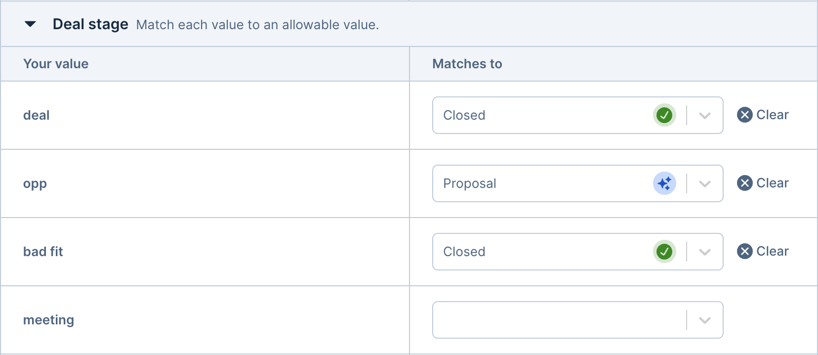
After the column matching step, the user will be prompted to match the values in their file to the given select options.
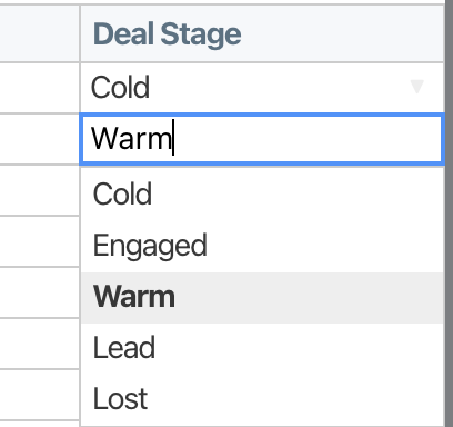
 On the review screen, the field will show as a dropdown menu that the user can pick an option from.
 A validation error will be shown if a value was not matched and does not equal one of the option labels.
`selectOptions` can be overridden for individual cells using a row hook. See the [Row Hooks](/reference/hooks#row-hooks) documentation for details.
A validation error will be shown if a value was not matched and does not equal one of the option labels.
`selectOptions` can be overridden for individual cells using a row hook. See the [Row Hooks](/reference/hooks#row-hooks) documentation for details.
Each select option can optionally include `alternateMatche`s\`, an array of strings. If an input value matches any of these, it will be mapped to that option's value.
For a given select field, the labels, values, and alternate matches should be unique across all options. Each of these parameters is used to map imported data to select options, so conflicts will occur if multiple select options share the same matches.
If set to true, select fields will allow the user to enter their own value. With `allowCustom` set to `true`, the user can either choose from the valid select options, or enter their own value. This treats the select options as autocomplete suggestions. Any value is considered valid, although you can add additional validations like normal.
By default, Dromo will suggest matches to the user with fuzzy matching, and, if you have backend sync enabled, AI matching. If you would like to disable fuzzy and AI matching, and only suggest exact matches to the user, you can pass the setting `exactMatchOnly: true` with the field settings. Dromo will check the label, value, and alternateMatches for an exact match.
For example, this is how you would enable both custom values and exact matches:
```json theme={null}
{
"type": ["select", { "allowCustom": true, "exactMatchOnly": true }],
"selectOptions": [
{
"label": "string",
"value": "string",
"alternateMatches": ["string"]
}
]
}
```
> ```json theme={null}
> {
> "type": "multi-select",
> "selectOptions": [
> {
> "label": "string",
> "value": "string",
> "alternateMatches": ["string"]
> }
> ]
> }
> ```
>
> or
>
> ```json theme={null}
> {
> "type": ["multi-select", {
> "delimiter": ",",
> "trimValues": true
> }],
> "selectOptions": [],
> "manyToOne": true
> }
> ```
#### For fields that allow selecting multiple values from predefined options[](#for-fields-that-allow-selecting-multiple-values-from-predefined-options "Direct link to For fields that allow selecting multiple values from predefined options")
Multi-select fields let users choose multiple values from predefined options. You must provide an array of valid `selectOptions`, where the `label` is shown in the UI; the `value` is saved in the output. The field outputs as an array of strings (`string[]`) containing the selected option values.
Multi-select fields are treated differently during the import process. Expand the section below to learn more.
After the column matching step, the user will be prompted to match the values in their file to the given select options (similar to select fields).
 On the review screen, the field will show as a multi-select dropdown or chip interface that the user can pick multiple options from.
A validation error will be shown if a value was not matched and does not equal one of the option labels.
`selectOptions` can be overridden for individual cells using a row hook. See the [Row Hooks](/reference/hooks#row-hooks) documentation for details.
On the review screen, the field will show as a multi-select dropdown or chip interface that the user can pick multiple options from.
A validation error will be shown if a value was not matched and does not equal one of the option labels.
`selectOptions` can be overridden for individual cells using a row hook. See the [Row Hooks](/reference/hooks#row-hooks) documentation for details.
Each select option can optionally include `alternateMatches`, an array of strings. If an input value matches any of these, it will be mapped to that option's value.
For a given multi-select field, the labels, values, and alternate matches should be unique across all options. Each of these parameters is used to map imported data to select options, so conflicts will occur if multiple select options share the same matches.
#### Delimiter Configuration[](#delimiter-configuration "Direct link to Delimiter Configuration")
By default, multi-select fields parse input data using a comma (`,`) as the delimiter. You can customize this behavior:
The character used to separate multiple values in the input data. Common delimiters include `,`, `;`, `|`, or any custom character.
Whether to trim whitespace from individual values after splitting. When `true`, values like `" apple , banana "` will be parsed as `["apple", "banana"]`.
Example configuration with custom delimiter:
```json theme={null}
{
"key": "skills",
"label": "Skills",
"type": ["multi-select", { "delimiter": ";", "trimValues": true }],
"selectOptions": [
{ "label": "JavaScript", "value": "js" },
{ "label": "Python", "value": "py" },
{ "label": "Java", "value": "java" }
]
}
```
#### Many-to-One Mapping[](#many-to-one-mapping "Direct link to Many-to-One Mapping")
Multi-select fields support many-to-one column mapping by setting `manyToOne: true` on the field definition. This allows multiple source columns to be combined into a single multi-select field. This is useful when your input data has multiple columns that should be merged into one multi-select output.
For example, if you have columns `"Interest1"`, `"Interest2"`, and `"Interest3"` in your CSV, you can map all of them to a single multi-select field with `manyToOne: true`, and the values will be combined into one array in the output.
Example:
```json theme={null}
{
"key": "interests",
"label": "Interests",
"type": "multi-select",
"selectOptions": [
{ "label": "Reading", "value": "reading" },
{ "label": "Gaming", "value": "gaming" },
{ "label": "Music", "value": "music" }
],
"manyToOne": true
}
```
#### Validation[](#validation "Direct link to Validation")
Multi-select fields automatically validate that all selected values match one of the provided select options. Invalid values will result in an error message on the review screen.
The field also checks for duplicate values within the same cell and displays a warning (not an error) if duplicates are found.
The checkbox field type is useful when you want to import a boolean (yes/no) field. The field will be displayed to the user as a checkbox and output as a JSON boolean (`true` or `false`).
When importing, the following case-insensitive values are considered false: `""` (empty cell), `"0"`, `"off"`, `"n"`, `"no"`, `"false"`, `"disabled"`. All other values are considered true.
### Email[](#email "Direct link to Email")
> `type: "email"`
Email fields are strings with built-in validation per the [HTML5 spec](https://html.spec.whatwg.org/multipage/input.html#email-state-\(type=email\)). There are some additional constraints: single domains (such as `contact@dromo`, with no TLD) and IP addresses are not allowed in the host portion.
### Country[](#country "Direct link to Country")
> `type: "country"`
>
> ```json theme={null}
> type: [ "country", { format: <"2-letter" or "3-letter"> }]
> ```
Country fields validate values against a list of valid country codes (either ISO 3166 alpha-2 or alpha-3) based on the `format` option. If not specified, "2-letter" is used.
### Phone number[](#phone-number "Direct link to Phone number")
> `type: "phone-number"`
>
> ```json theme={null}
> type: [ "phone-number", { country: <2 letter iso country code>, format: "national" | "international" | "both", outputFormatted: boolean }]
> ```
Phone number fields can be used to validate phone numbers in many different scenarios.
When format is `"international"` (default), the field validates full international numbers with country codes, displaying them with spaces (e.g., +1 212 867 5309) but outputting in E.164 ("+33123456789"), unless `outputFormatted: true`.
With format: `"national"` and a country (e.g., `"US"`), it validates local numbers and displays them in national format (e.g., (212) 867-5309), outputting digits only unless outputFormatted: true.
Use format: `"both"` with a country to accept both international and national formats. All values are displayed and output in international format.
### Social Security Number[](#social-security-number "Direct link to Social Security Number")
> `type: "ssn"`
>
> ```json theme={null}
> type: [ "ssn", { outputDash: }]
> ```
Social security number fields can be used to validate US SSNs. The input can be either 9 digits or 11 digits with dashes. The output is a string of digits, optionally including dashes if `outputDash` is set to `true`. This (obviously) does not validate the actual SSN.
### Domain[](#domain "Direct link to Domain")
> `type: "domain"`
>
> ```
> type: [ "domain", { allowSubdomains: }]
> ```
Domain fields validate input as a proper domain name (no paths, queries, or fragments), checking subdomains based on the `allowSubdomains` option, which defaults to true.
If you need a field that accepts paths and query params, consider using an URL field.
### URL[](#url "Direct link to URL")
> `type: "url"`
>
> ```json theme={null}
> type: ["url", { acceptedProtocols: array of accepted protocol strings. e.g: "https", "ftp">, acceptedDomains:
}]
> ```
URL fields can be used to validate and normalize all URLs. You can optionally specify a list of accepted protocols (like `https`) and/or domains (`like dromo.io`).
The value of the URL will be normalized to strip extra dashes and relative path references. For example, an input of https\:///dromo.io/foo/../bar is a valid URL, but will be normalized to the value `https://dromo.io/bar`.
> `type: "us-state-territory"`
US State/Territory fields can be used to validate values against standard US state and territory postal codes. The input can be both 2-letter ISO state/territory codes or 4-letter codes. e.g. `AL` or `US-AL`. The output is a 2-letter code.
### US Zipcode[](#us-zipcode "Direct link to US Zipcode")
> `type: "us-zip-code"`
>
> ```json theme={null}
> type: ["us-zip-code", { outputDash: , format: <"5-digit"|"9-digit"> }]
> ```
US Zipcode fields can be used to validate values against US zip codes, either the 5-digit or 9-digit "ZIP+4" variant, specified by the `format` option.
* `5-digit` format accepts 5 or 9 digit values (with or without dashes), but truncates 9-digit inputs to the first 5 digits. Shorter values are left-padded with zeros (e.g., `342` → `00342`).
* `9-digit` format does not accept 5 digit values. It will accept only 9 digits, with or without dashes.
Any value that contains characters other than dashes or digits will be invalid.
### UUID[](#uuid "Direct link to UUID")
> `type: "uuid"`
```json theme={null}
type: ["uuid", { version: }]
```
The UUID field is a string field that validates UUID format and version number, if provided. The field uses the built-in `validate` function provided by `uuid` library. If `version` is provided, it will also check the UUID version using the `getVersion` from the `uuid` library.